Component Anatomy
In Angular, a component is a class decorated with the @Component decorator.
Let's explore each part of a component in detail:
Selector
The selector defines the custom HTML tag that represents your component in templates.
This is the tag you'll use to include this component in a parent component's template — i.e. <mc-hello/>.
Prefix
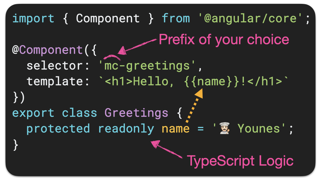
You can choose any prefix for your selector, but you may need to configure your linter to accept your prefix — instead of the default value which is app.
When generating a new app, you can use the --prefix option to set your prefix, and let Angular configure the linter for you.
Template
The template defines the view for your component.
It is an Angular template, not plain HTML. So you might see things there that are not allowed in plain HTML.
While it's also possible to write your template in a separate HTML file using the templateUrl property, I highly recommend writing it inline — as shown in the example above.
In my experience, teams that favor inline templates naturally build more focused, cohesive components — resulting in cleaner structure and a more maintainable codebase. With less file clutter, the project structure is also more readable.
Styles
The styles defined in the styles property are scoped to the component. By default, they do not leak outside the component — not even the children.
Just like templates, I highly recommend to write styles inline — as shown in the example above.
An exception is components with heavy styling — like a fancy banner. In that case, it often makes sense to move the styles to a separate file.
TypeScript Logic
The TypeScript class contains the logic that controls the behavior of your component.
Why use protected for properties?
When you mark a component's property as protected, it's only accessible from the component's TypeScript logic and its template — but not from outside the component. This prevents anything else from accessing it directly.